After purchasing the host and the domain you want to set up the site and install the required CMS, the next step ahead of you is to design the template for the site. When a user logs in, the design of your site is the first thing that attracts his or her attention. A beautiful site design can give the user a sense of calm and comfort and keep him on your site for a long time, but if it is disordered at first glance, it will cause the user to opt out of scrolling your site and exit him.
In this article, important points in the design of the site are examined, which is necessary for all professional and beginner users and can prevent many mistakes. As a site designer, you need to make the visitor become the permanent user of your site at first glance. Below we will introduce you some important points in the design of the site.
1- Have an attractive color:
Studies have shown that the correct use of colors and the balance between them make a difference in the jump rate and conversion rate. Colors are powerful and important tools in the design of a site. As a result, the principles of using colors and their combinations should be observed in the design of the site.For example, the use of contrasting colors makes the elements of the site clearer and clearer.
When designing a site in color selection, you should consider the theme of the site that you are designing the template. For example, in scientific and research sites, content and articles are more important and simple coloring should be used. Another interesting point is the use of black text with a white background. This simple coloring prevents the user’s eye fatigue and causes the user to spend a long time reading articles.
In the design of the store site and services, it is better to use happy and spicy colors. Especially for specific buttons and entries to get more customer attention for clicking or signing up. The use of spicy colors should only take place in the sections where you intend to attract the user’s attention. Excessive use of spicy colors and high contrast will cause fatigue and dissatisfaction.
2- Care more about font size and type:
Another important point in site design is the use of legible fonts of the right size. More than 95% of information on a site is transmitted through the language of the document. A text with appropriate text increases the readability, availability and usability of a site for the user. So choosing a beautiful font with the right size plays a direct role in the interface of your site. Also, select a font that is fully compatible with all browsers and displayed correctly. If the content of your site is too small or too large, the result will be user dissatisfaction and leaving the site. When a user logs into the pages of your site, they should be able to read the content easily and do not need to zoom in.
3- Easy routing in menus:
Other important points in site design should be mentioned menus and easy routing on the site. Unfortunately, many Iranian sites are confused when the user wants to go to the desired section. For example, a corporate site has a special recruitment page, but when searched in the site menu there is no part called employment and the user after visiting the site should search all the pages for the desired section or leave the site inconclusive!
You should consider the shortest route for the user to access the desired content. If the content is large, you can use 2 or more different menus and expand the segmentation of the content so that users can achieve their demands in the shortest possible time.
You can also use different sections in the side columns of the site and include the most widely used parts of your site. Another way to improve site routing is to place a sitemass. In this way, visitors can easily find and enter their desired page by visiting the sitema map section.
4- Use quality and creative images:
The first and most important goal of using images in the design of the site is to have a good look and look like the site. But not that you use any old and repetitive photos and expect the user to like your site.
No user will enjoy seeing a dry, soulless site. Use relevant and quality images to use images correctly in site design. This is very important in the design of the site. Because the use of images also has its own rules.
Images should be selected with good quality and low volume so as not to slow down your site. Note that site speed is an important factor in SEO that you should consider all aspects of it from the beginning.
The size of the images should also be chosen according to your content. For an article, a medium-sized image (600X400) is enough and use small-sized images for menus and site logos. The use of too large images in the content makes the site pages heavy, resulting in a slowdown in the loading speed of the site.
If you’re writing long articles, be sure to use one or more related images. Because the images both diversify and refresh the reader and make it easier for him to understand. A suitable and relevant image sometimes helps the user understand more than a few lines of explanation and text.
Using the image according to the subject is another important point. Try to take as many quality photos as you can and use them. If you can’t choose high-quality photos for your site.
5- Design a suitable contact form:
Having a simple contact form to communicate with the user with you is another important point in the design of the site. A forgotten section is the presence of contact section and contact information. Imagine that the user is logged in to your site and is interested in your goods or services and needs to get in touch with you by email or phone for more information, but you have not shown any way of communication to the user.
Placing contact information in the visible and upper part of the site will help you in two ways:
- Ensures the user’s activity: When a service site places your phone or email information on the site, it is much more reliable than other sites that have just placed an email or don’t have a contact section at all.
- Makes more sales: On a site where users can easily communicate with you and all your contact information is ahead of them, naturally more sales will be done. Because the user will trust you more.
6- Speed up the site:
A very important part of both site design and seo optimization and SEO is related to site speed. The basic part in the speed of the site is to choose the right host and then use content distribution networks or CDN.
After these steps, other issues related to the type of site design and programming that you must observe. Otherwise, no matter how useful and useful you provide, but have a slow site, you will not have a good ranking in the search results. Site speed is one of the most important points that should always be taken into account.
Observing the following points when designing a site will help you to increase the speed of the site:
- Minimal use of JavaScript and CSS:
If you need to use Java script code on your site, try moving these codes to the end of the site pages so that it doesn’t make the site heavy when loaded.
Also, in writing CSS, try to put all variables in one or two files and avoid creating multiple CSS files in different parts of the site. Because it will slow down the site too much.
- Standard use of multimedia:
Images and even video are used to clarify the topic and better convey the content to the user. But this use should be standardized. If you’re using video in your articles, try to get the right volume to load faster. Also, make the site images as compact as you can.
Try to place the multimedia used on your host and do not link to external sources. For example, you have placed a picture in your article, but that image is on another host and you just linked it on your site.
So every time a user wants to read that article, the image file must be uploaded from another site. If that site is out of reach, the browser will spend a lot of time loading the image, resulting in a dramatic slowdown in the speed of your site. That’s why try to always host all the content and files of the site when designing the site on your host.
7- Design a responsive site:

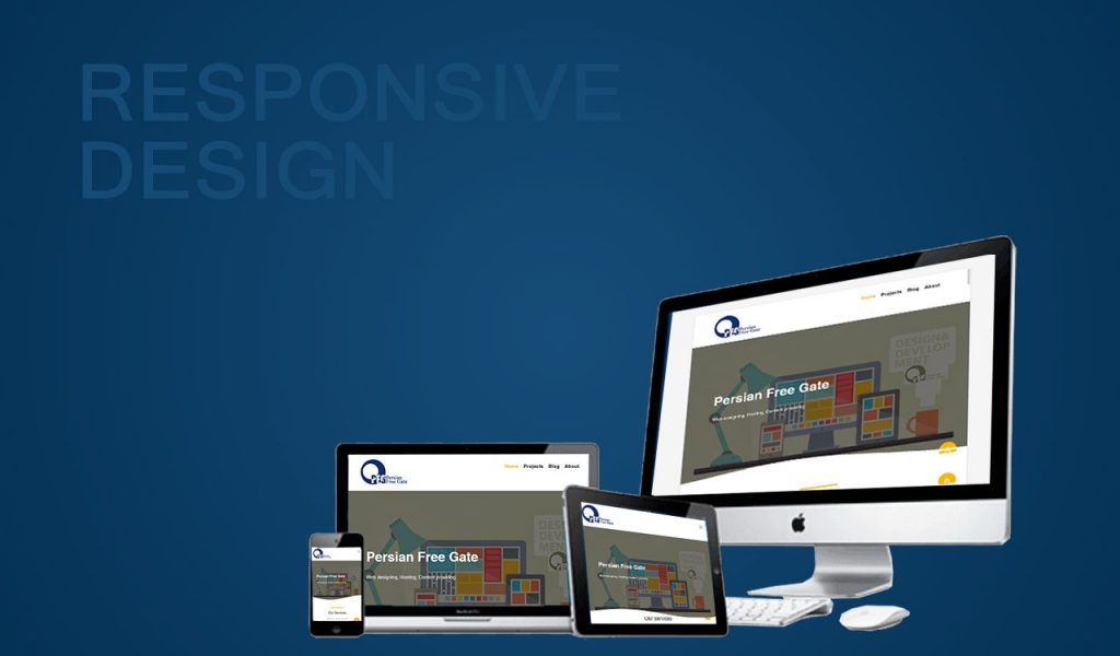
The number of users surfing the web over a smartphone is increasing day by day. So it’s a successful site design that can be displayed on all devices. Now this device is a mobile phone or tablet and even a smart TV. Your site should be responsive and align itself with any screen size.
The menus and images of the site should also be displayed on different devices without problems and the user does not need to scroll in different directions to navigate the site. Font sizes should also be coarser on mobile phones so that they do not lose the ability to be legible.
In general, designing a responsive site is associated with your user interface and SEO. If your site is not responsive, the user cannot easily search the site and achieve its goals. That’s why it has left the site, the jump rate will increase and it will have an impact on the SEO of the site.

